Choosing Kitchen Colours: Timeless Palettes for Luxury Homes


Colour is one of the first things people respond to in a kitchen. Before you notice storage, layout, or appliances, you notice the atmosphere. A palette can make a kitchen feel calm and architectural, warm and welcoming, or crisp and quietly luxurious.
In a premium kitchen, colour is rarely about chasing whatever feels current. The combinations that last are the ones that sit comfortably within the architecture of the home, respond well to natural light, and continue to feel elegant in everyday use. That is especially true in Dubai, where bright light and open, contemporary interiors can change how colours appear across the day.
At Häcker Dubai, colour is approached as part of the wider design language of the kitchen. It works with materials, layout, finishes, and proportion to create a space that feels balanced rather than overstated. If you are choosing a palette for a new kitchen, or refining an existing vision, timeless combinations usually offer the strongest foundation.
What makes a kitchen colour feel timeless?
Timeless kitchen colours tend to have a few qualities in common. They are balanced rather than extreme. They work with light rather than fighting against it. And they leave room for materials such as wood, stone, metal, and texture to bring depth into the design.
Soft neutrals are often the starting point. Whites, off-whites, taupes, greiges, and warm stone tones feel composed and adaptable. They can sit comfortably in both villas and apartments, and they allow the rest of the kitchen to breathe. In bright Dubai light, these shades often read more clearly and elegantly than colder or more saturated colours.
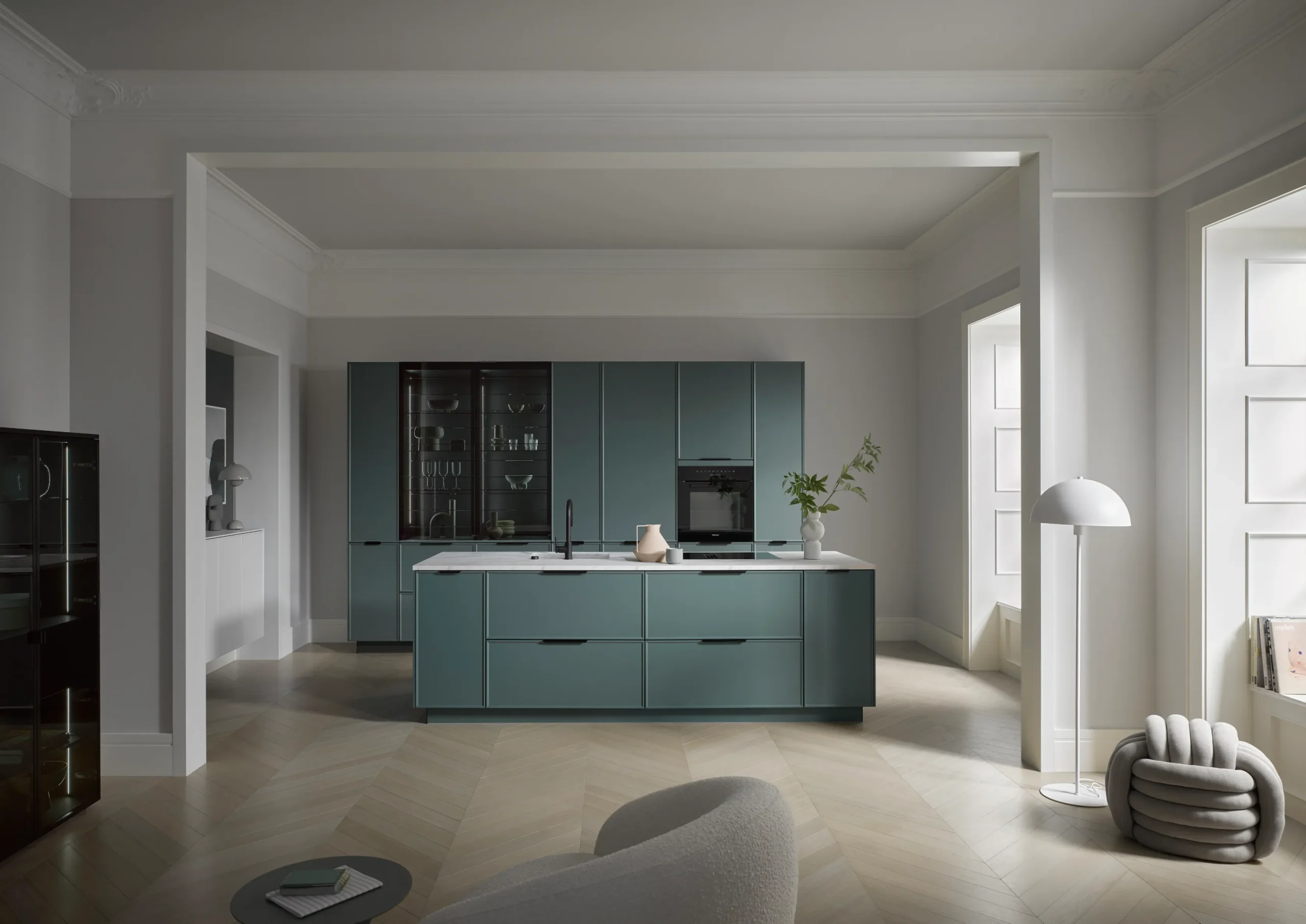
Contrast also plays a role, but the most enduring kitchens usually use it with restraint. A dark island against lighter cabinetry, a warm wood detail within a pale scheme, or a black accent against soft neutrals can all add definition without making the kitchen feel tied to a particular trend.
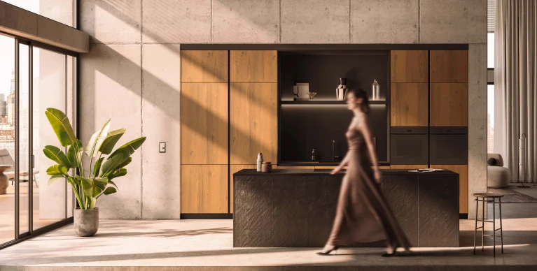
Material warmth matters just as much as colour itself. The same grey can feel cold or inviting depending on whether it is paired with oak, brushed brass, stone, or matte lacquer. This is why a timeless palette is never just about choosing one “best” shade. It is about building a combination that feels layered, refined, and natural within the home.
What is a good colour for a kitchen?
There is no single best kitchen colour, because the right choice depends on the home itself. Light, room size, surrounding finishes, and architectural style all influence which colours will feel most successful.
White and off-white kitchens remain popular for good reason. They bring brightness, clarity, and a sense of openness, particularly in homes where the kitchen forms part of a larger living space. They also create a calm backdrop for natural stone, timber, and glass accents.
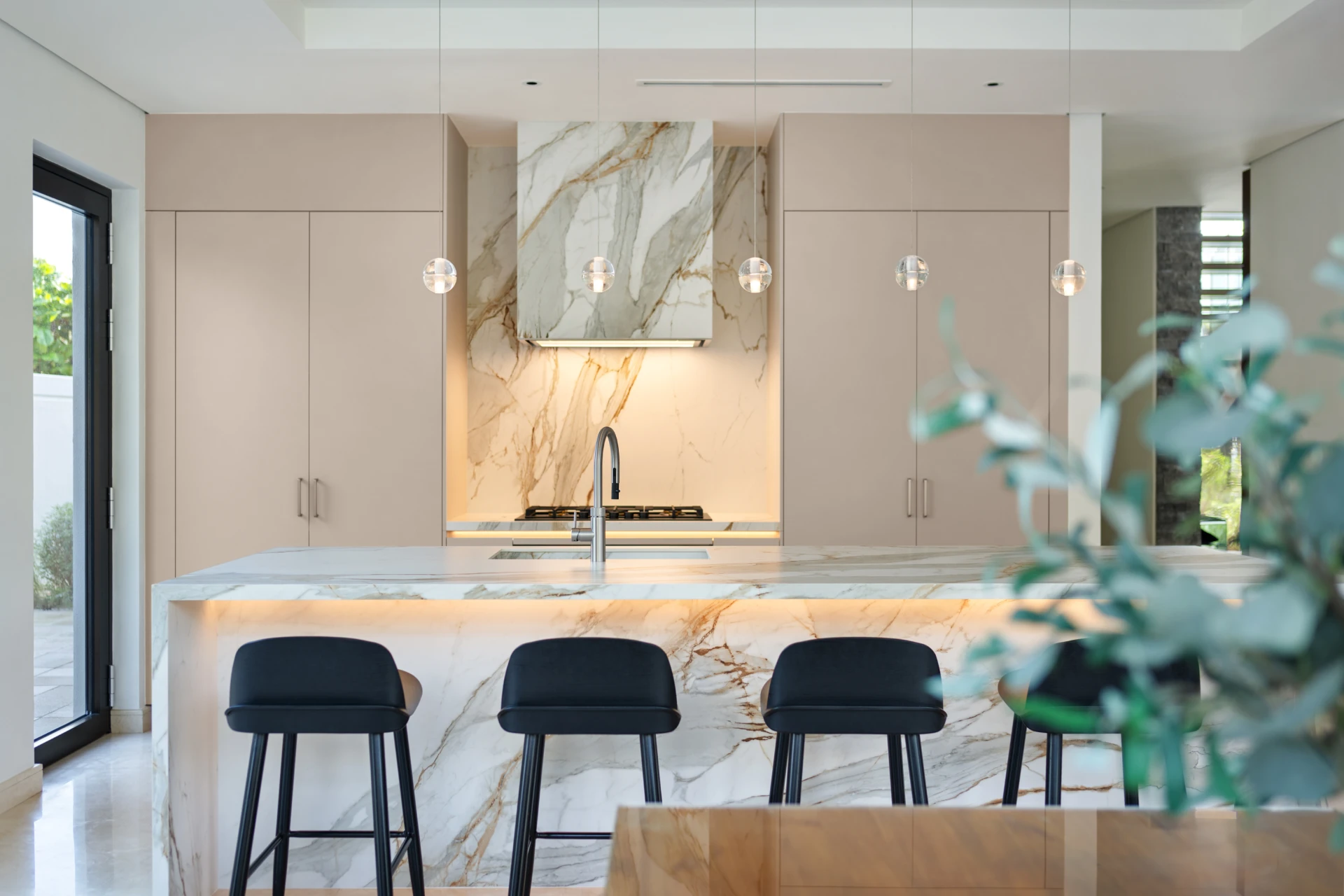
Warm beige, taupe, and cream offer a softer effect. These shades feel more layered than pure white and often suit luxury homes where the goal is warmth rather than stark minimalism. They work especially well with natural materials and classical detailing.
Soft grey continues to be a dependable choice for more understated contemporary kitchens. It introduces definition while remaining neutral enough to feel calm over time. The key is usually to pair it with warmer elements, so the overall palette stays inviting.
Muted earthy tones can also work beautifully when handled with care. Clay, sand, mushroom, olive-grey, and similar shades bring depth and softness without overpowering the space.
Timeless kitchen colour palettes that work beautifully in luxury homes
White and warm neutral kitchens
White and warm neutral kitchens are among the most enduring palettes because they feel calm, bright, and architecturally clean. In homes with strong natural light, they help surfaces feel soft rather than heavy, and they make the kitchen feel open without appearing clinical.
This palette also gives you flexibility. White, ivory, soft beige, and pale taupe can be layered with timber, stone, and brushed metal finishes to add warmth and quiet detail. In both apartments and villas, the result is often a kitchen that feels refined without trying too hard.
What colour goes with a grey kitchen?
Grey works best when it is treated as a foundation rather than the full story. On its own, it can feel restrained to the point of flatness. Paired well, it becomes elegant and quietly modern.
Warm white is one of the safest and most timeless partners for grey cabinetry. It lightens the palette and keeps the overall effect fresh. Taupe and soft stone shades add warmth and sophistication, helping grey feel more layered and less stark. Natural wood, particularly oak or walnut, introduces texture and visual softness, which is often what makes a grey kitchen feel complete.
This kind of palette suits homes that lean contemporary but still want a sense of comfort. It also works well in open-plan settings, where the kitchen needs to sit comfortably alongside living and dining materials rather than feel too sharply separated.
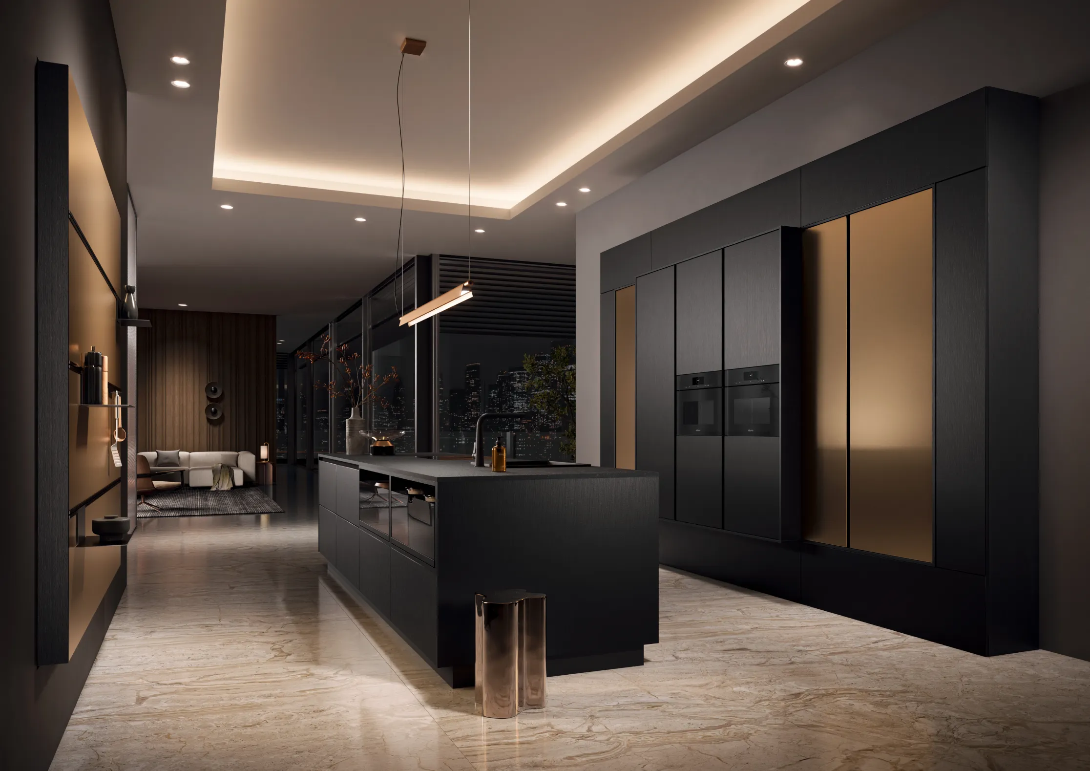
What colour goes with a black and white kitchen?
Black and white kitchens have strong visual clarity, but the most successful versions usually soften that contrast with warmer supporting tones. Without that balance, the scheme can feel more graphic than luxurious.
Oak and walnut are particularly effective because they bring warmth, texture, and a more residential feel to the palette. Soft beige and muted stone shades help reduce the hardness of the contrast while keeping the scheme polished. Brass accents can also work beautifully, adding a subtle sense of richness without becoming dominant.
The result should feel balanced rather than dramatic for its own sake. In a premium kitchen, black and white works best when it is grounded by material depth and restrained detailing.
Cream kitchens with complementary flooring
Cream kitchens work best when the flooring continues the same sense of warmth and softness. Rather than introducing a finish that feels too cool or too contrasting, it is usually more effective to choose tones that sit comfortably within the wider palette.
Warm stone shades, soft beige, light taupe, and pale greige all pair well with cream cabinetry because they preserve a calm, cohesive feel while still giving the room enough variation to avoid looking flat. These combinations help the kitchen feel settled and balanced, particularly in homes where the design leans towards understated elegance rather than sharp contrast.
In more contemporary spaces, slightly deeper greige or sand-toned flooring can add definition without interrupting the softness of the scheme. In more classic interiors, warmer neutral flooring often feels more natural alongside cream cabinetry and layered material finishes.
Internal link: https://hacker.ae/kitchen-cabinet-guide-construction-types-premium-options/
Kitchen colour combinations at a glance
| Base kitchen colour | Works well with | Overall feel |
| White | Taupe, beige, soft wood | Bright and refined |
| Grey | Warm white, stone, oak | Calm and contemporary |
| Black and white | Walnut, brass, beige | Bold but balanced |
| Cream | Greige, sand, warm stone | Soft and elegant |
How to choose the right kitchen colour for your home
The best kitchen scheme usually starts with the home, not the sample card. Natural light is one of the first things to consider. Bright spaces can handle slightly deeper or warmer tones without feeling closed in, while darker rooms often benefit from lighter, more reflective colours.
It also helps to look closely at the surrounding finishes. Flooring, worktops, splashbacks, and adjacent living materials all affect how a kitchen colour will read. A shade that looks perfect in isolation may feel completely different once it sits beside stone, timber, or metal.
You should also think about the mood you want to create. Some kitchens benefit from soft continuity, where tones blend gently into one another. Others feel stronger with a degree of contrast that adds structure and emphasis. Neither is inherently better. It depends on whether you want the kitchen to feel quietly integrated or more visually defined.
Style direction matters too. Homes that lean classic often respond well to warmer neutrals, layered textures, and softer tonal changes. More contemporary interiors can carry cleaner contrasts and cooler notes, as long as the overall palette still feels resolved.
Explore more examples of colour pairings and finishes in Häcker’s materials and colours collection and discover completed projects in the portfolio.
Discover your perfect kitchen colour scheme with Häcker.
FAQs
Which is the best colour for a kitchen?
The best kitchen colour depends on the light, layout, and atmosphere you want to create. In most luxury homes, the most successful palettes are the ones that feel balanced and easy to live with over time rather than the ones that make the strongest first impression.
What is the best colour for a high-end kitchen?
Whites, warm neutrals, soft greys, and layered earthy tones all work well in high-end kitchens. They create a refined base and allow materials such as wood, stone, and metal to bring depth into the design.
What colours go best with a grey kitchen?
Warm white, taupe, natural wood, and soft stone shades are among the most reliable pairings. They soften grey and help the kitchen feel more complete and inviting.
What colours go best with a black and white kitchen?
Walnut, oak, beige, brass, and muted natural stone tones all work well. They introduce warmth and texture, which keeps the contrast feeling elegant rather than severe.
What colour floor tiles work with a cream kitchen?
Warm beige, light taupe, pale greige, and stone-look tiles are strong options. They complement cream cabinetry while preserving a soft, cohesive feel across the space.
Start your kitchen journey with Häcker Dubai
A timeless kitchen palette should feel elegant now and reassuring years from now. It should support the architecture of the home, respond beautifully to light, and still feel comfortable in everyday life.
At Häcker Dubai, colour is never chosen in isolation. It is part of a wider design process shaped by craftsmanship, precision, material quality, and a clear understanding of how the kitchen will be lived in. Whether you already have a strong visual direction or are just beginning to explore what feels right for your home, the design team can help you shape a palette that feels both personal and enduring.
Visit the Häcker Dubai showroom or book your complimentary consultation to start exploring your next kitchen. You can also plan a showroom visit if you would prefer to see finishes and materials in person.
Read More
![JBR Kitchen- Sepide Uhlmann]()
Kitchen Worktops & Backsplashes: Materials, Performance & Style
Learn MoreWorktops and backsplashes sit at the point where appearance and performance meet. They ...
![]()
Kitchen Cabinet Guide: Construction, Types & Premium Options
Learn MoreIt’s usually the small things that give a poorly-designed kitchen away. Reaching for so...


Create a kitchen that is as individual as you.
German crafted, Exquisite Häcker Kitchen is waiting just for you.
Speak to Our Designers Now!